
Welcome to a new bookish journey around the world! Quite recently I read My Brilliant Friend by Elena Ferrante, and in that blog post I was mentioning how unattractive I found the book covers of the series. So I was curious to see whether other editions are better-looking … and fortunately, the answer is “yes!”. I made a selection of interesting and/or intriguing covers from 9 countries that you’ll see below 🙂
Note: if you haven’t read the book, I recommend you to first get acquainted with the basic storyline, to better understand the cover illustrations and the remarks I wrote for each of them.
Let’s start by showing you the English edition, the one I read. No more comments here.
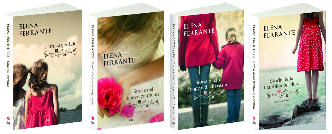
Later edit: the original Italian edition has the same covers as the English one

Up North, in Norway, I found another approach toward the book covers. A lot of white, a little bit of black, quite simple, and maybe a bit too banal for my taste.

The Dutch edition has the same black & white theme, with a little bit of colour added.

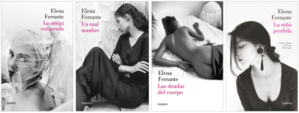
Guess what!? The Spanish edition also goes for black & white, but with weirder pictures, I would say. There’s such a big contrast between the Dutch edition, with children on the covers, and the Spanish edition, which looks quite erotic.
After so much black & white, it’s time for some color! I think that my home country, Romania, has the most colourful covers of them all. Still, for me, it’s a bit too much …

The German edition looks much more appealing, using graphic illustrations instead of photos of real people. I like this one a lot – the colours, the images, the aura of the books – everything!

Another wonderful edition is the Italian one ❤ Colorful, yet simple enough to spark interest, modern and a bit girly. Great combination!
Down under, in Australia, we find a different style of book covers. Here we have mature images with a lot of black and a little bit of white. I especially like the lines that enframe the covers. An interesting and different approach I would say!

I also found the Chinese edition of the first book of the series, which has a totally different approach than the ones I’ve shown above.

To conclude our adventure, I want to tell you that I was impressed by the variety of approaches toward the covers of the same books – some are black & white while others are very colourful, some depict children while others depict erotic scenes, some are playful while others are sad … Just by looking at the book covers (without seeing the title of the book), one might easily think they’re not the covers of the same story.
I hope you enjoyed this bookish journey as much as I did! Now tell me: what’s your favourite edition? I cannot make up my mind between the German edition and the Italian edition 🙂
If you would like to buy books or other (non)bookish things, please consider using one of these links: Amazon | Waterstones | Carturesti. Thank you!
‘Till next time … happy reading!
Georgiana
PS: Now I must say am pretty happy with the cover of the book I read, it doesn’t seem so ugly anymore …
Images sources: English | Romanian | Italian | Norwegian | Australian | Dutch | German | Chinese | Spanish | World map

You should take a look at the French covers. They are my favourite so far, and seem to fit in with the time when the events in the book take place.
LikeLike
Thanks a lot for the suggestion! 🙂
LikeLiked by 1 person
Oh, and the original Italian covers were identical to the English ones – in fact, the English ones were based on them.
LikeLike
The one of the best cover in my opinion is from South Korea.
LikeLike
Hello! I couldn’t find on the internet the South Korean covers … Could you please share with us a picture/link with them? Thank you! 🙂
LikeLike
loving the german version! But the italian edition is exactly like the english one, the original one in fact 🙂 not the one you found.
LikeLike
Thank you for pointing this out, Sara! Maybe the edition I found was published more recently, or maybe I misunderstood the Italian website 🙂
LikeLike